Cluster
and Outlier Analysis
Introduction
Cluster
and outlier analysis are examples of unsupervised machine learning. It requires
no prior knowledge about the data nor does it do any detailed analysis of the
data. It seeks to group similar (in some sense) data into groups (clusters).
Thus, it can help reduce a large volume of data to a few exemplar items which
you can then subject to detailed analysis (i.e. indexing, structure solution
& refinement) by other means. The implementation in GSAS-II uses the
cluster analysis tools found in the scipy library as well as those found in the
Scikit-learn library. In this tutorial we will use items from both libraries
that have been selected as useful for powder diffraction data (PWDR) as well as
Pair Distribution Function (PDF) data. At each step in a cluster analysis,
there are a variety of options available for each of the algorithms. Some of these
work better for some kinds of data and others for different kinds of data. Data
taken during e. g. a temperature series tend to track along a curve with the
points bunched about structural phases encountered in the experiment while
sampling experiments tend to be bunched into more globular clusters. These
require different choices of clustering algorithms to successfully group them.
For
this tutorial we have prepared a GSAS-II project file with 34 data sets that
were originally used to certify a NIST SRM (676c Al2O3
amorphous content) and consists of 2 each of silicon (SRM 640c) and Al2O3
(SRM 676c) along with 30 50/50 weight fraction preparations of Si/ Al2O3
mixtures. They were taken from a suite of measurements done on the POLARIS
diffractometer at the ISIS Facility, Rutherford-Appleton Laboratory, Chilton,
UK. Thus, we should be able to group the measurements into 3 distinct clusters
during this demonstration. If you have not done so
already, start GSAS-II.
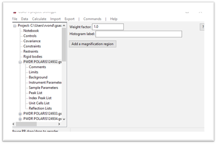
Step 1. Open the
project file
1.
Use
the File/Open
project… menu
item to open the provided project file. Change the directory to ClusterAnalysis/data to find the file.
2.
Select
SRM.gpx and press Open. The project will open showing
the 1st data set. You should immediately save (use File/Save as…) this project somewhere in your
workspace; you can also save it again while doing this tutorial if desired.
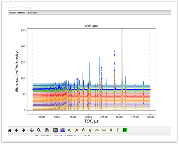
and
the powder pattern for it
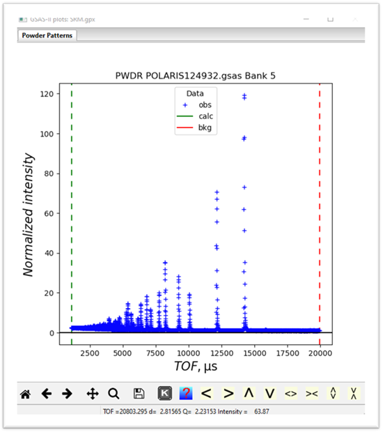
If
on the plot, you press the “m”
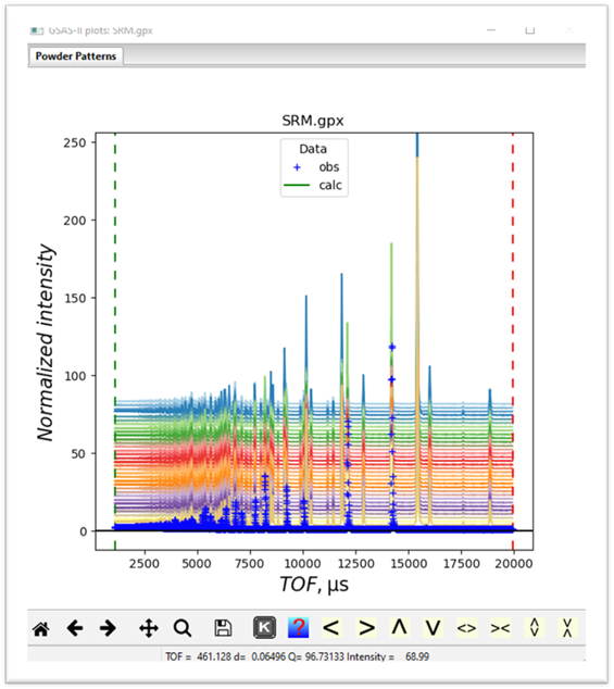
and “u” keys you will see a waterfall
plot of all the data
3.
You
should immediately save this project somewhere in your workspace; do File/Save as… You can also save it again
anywhere in this tutorial if desired. Notice that all this data are from the
same bank of detectors on POLARIS and thus have the same extent and step size.
Cluster analysis on mixtures of data types will simply group them mostly by
data type rather than by what is in the patterns themselves; probably not
useful. Cluster analysis can use the
full extent of the data sets but it might be faster and have better
discrimination with a narrower part of the data. Looking at this plot one could
usefully trim off all the data below TOF=7500. Keep this in mind when we set up
the cluster analysis data below.
Step 2. Setup Cluster
Analysis
If you
have never tried cluster analysis in GSAS-II, this step will try to install
Scikit-learn as a new python package. NB: you must have internet access for
this to succeed. Once done, this installation will not be repeated. Do Calculate/Setup
Cluster Analysis
from the main GSAS-II menu. This may take some time – be patient. If it
succeeds, there will be extensive messages on the console which will show the
installation of scikit-learn and some other things in your python and a new
entry will show in the GSAS-II data tree. Its data window will show
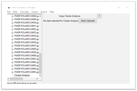
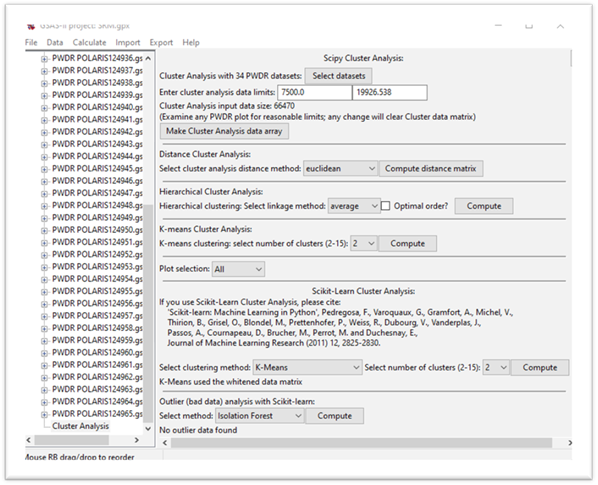
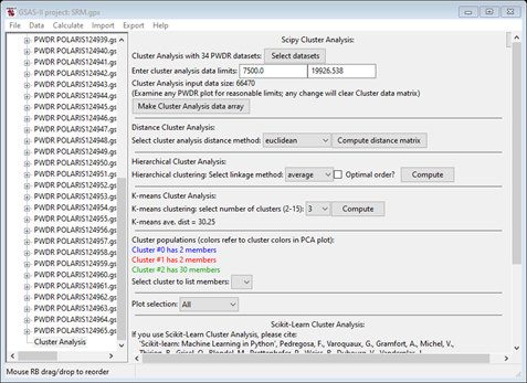
Step 3. Select data for cluster analysis
To select data to be used for cluster analysis, press the Select datasets button; a data selection popup will appear
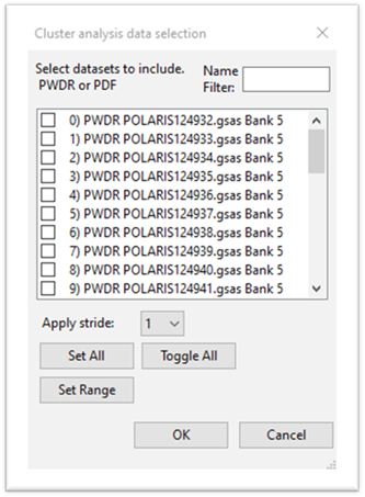
Press Set All and then OK. The display will change
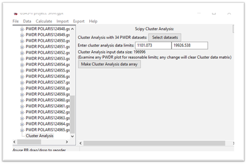
The input data size is the product of the number of data sets and the number of points in each data set, a matrix of this size will be formed next. Pay attention to this size; processing a >1M matrix will be significantly slower than a smaller matrix. Recall we want to use TOF=7500 as a lower limit; enter that for the 1st data limit. The window will be redrawn showing a smaller matrix size.
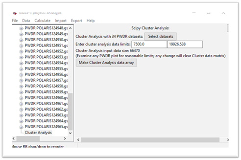
Press the Make Cluster Analysis data array button.
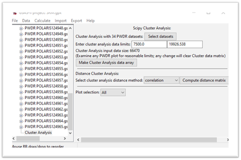
Step 4. Make distance matrix
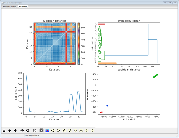
In this step we will form the array of distances between each pair of data sets. There are several methods for doing this; they differ by what is meant by “distance”. Press the ”?” button at the top of the window to see the mathematical details if desired. Press the correlation button and select euclidian. This gives the conventional distance between the ends of the multidimensional data vectors. The display changes and a new plot tab is produced
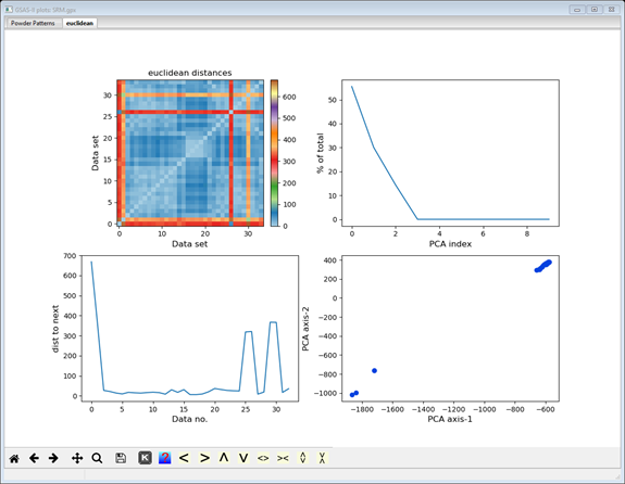
The display now shows additional cluster analysis processing steps including those available from Scikit-learn; we will cover these in the next steps. The plot tab is labeled by the distance method used to make it (euclidian); thus, a different plot tab will be produced for each distance method you try. There 4 plots on the plot tab. The top one shows a 2D matrix of the Euclidian distances color scaled by their magnitude. You can clearly see that there are major differences (long distances; red & orange) between data sets #0, 1, 26 & 30 and the others, and that the others are quite similar (short distances; blue). It also appears that #0 & 26 are a similar pair and #1 & 30 are another similar pair; note the blue at their intersection. The bottom right plot is a 2D plot of a Principal Component Analysis (PCA) of the distance matrix; it clearly shows 3 groups (clusters) of data points. The upper right shows the significant dimensions of the PCA; generally 2 or 3 suffice. The lower left plot shows the serial distances between the data set; this can be useful for detecting phase changes. Each of these four plots can be independently zoomed and if you select a point in the PCA plot, the status bar will identify the data set it corresponds to.
Step 5. Hierarchical Analysis
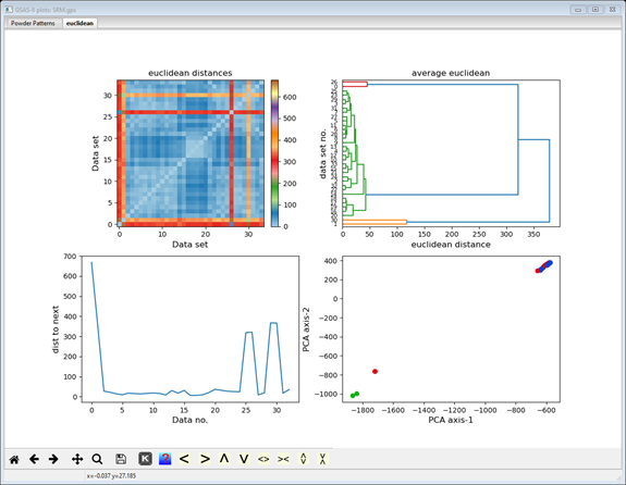
Although obvious in this case, it may be useful to consider how the data sets are “related” (linked) in some sense to each other and group those that are linked into a hierarchy. There are several possible methods for this linkage; we’ll use the default (”average”). Press the Compute button in the Hierarchical Cluster Analysis section; the plot tab will change.

The upper right plot is replaced by a hierarchy plot (dendogram); the others remain the same. The hierarchy plot shows pretty clearly the grouping of two data items at the top and two at the bottom with all the rest (30 items) together in the middle. The vertical axis lists the data set numbers (0-35; not in order) and the horizontal axis is scaled in distance. You can try the other linkage methods; they all give similar results. Different distance methods (they show in different plot tabs) may also give different hierarchies. Feel free to try them out but be sure to end with Euclidian to be consistent with this tutorial.
Step 6. K-means Cluster Analysis
The K-means algorithm attempts to group the data items into clusters by comparing their Euclidian distance from each cluster mean. It is a trial-and-error process starting from randomly selected mean positions for your chosen number of clusters. Thus, it will not produce the same result every time. Change number of clusters to 3; the computation is automatic. There is no need to press Compute. Both the data display and the plot will change
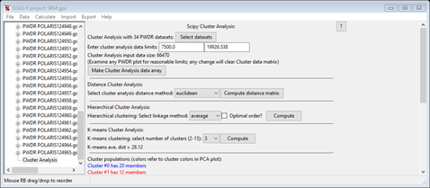
Notice that the listing of Cluster populations is unexpected from what we see in the 2D PCA plot and what the hierarchy plot showed. Press Compute to repeat the K-means calculation (you may have to do it more than once – I had to do it 3-4 times) to get something like
 Notice
that the lines in the cluster populations match the point colors in the 3D PCA
plot; there should be one with 30 members and two with two each and that the
plot shows them properly grouped (they weren’t in the earlier tries). NB: yours
may be in a different order and in any event, the colors in the hierarchy plot
are not related to these. Now select one of the 2 item clusters (I used #2 in
my list) for the list
members pull down; the data display will change.
Notice
that the lines in the cluster populations match the point colors in the 3D PCA
plot; there should be one with 30 members and two with two each and that the
plot shows them properly grouped (they weren’t in the earlier tries). NB: yours
may be in a different order and in any event, the colors in the hierarchy plot
are not related to these. Now select one of the 2 item clusters (I used #2 in
my list) for the list
members pull down; the data display will change.
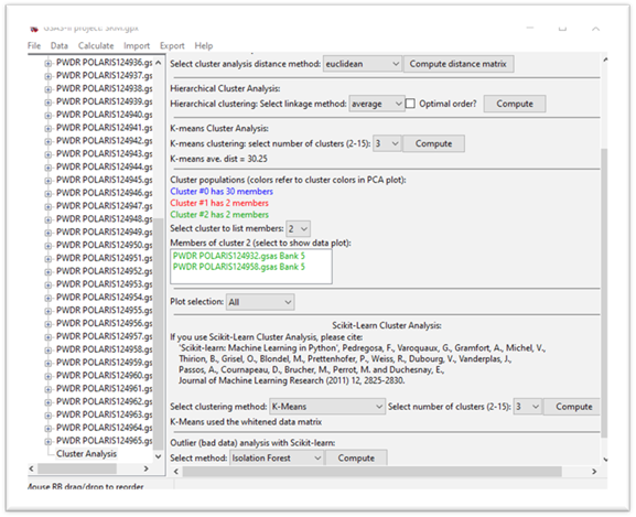
There is now a listing of the data members of this cluster in the chosen cluster color. If you select one item in this list, the data will be displayed in the powder pattern plot tab. If you press ‘m’ and ‘u’ on the plot, you’ll see where in the data sequence your selection falls.
Step 7. Cluster Analysis with Scikit-learn
Next, we will try the Scikit-learn version for cluster analysis. There are 5 different methods; the details of the algorithms can be found in the Scikit-learn documentation here. Some require you to select number of clusters, while others attempt to determine the clustering. Some use the data matrix while others use the distance matrix and are thus sensitive to the distance method used above in Step 4. For example, be sure the number of clusters is 3 and set the method to Agglomerative clustering. The computation will proceed automatically, the data window is redrawn, and the plot changed.
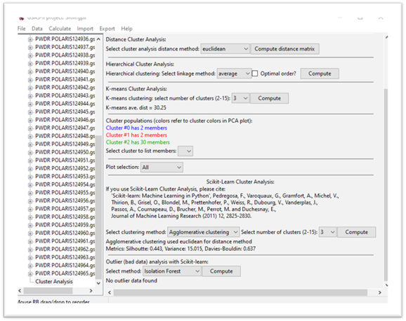

In this case the clustering succeeds in giving 3 clusters with the correct membership on the 1st try. For K-means here, you again may have to try more than once to get the correct clustering. Try other choices for the method and if wanted, change the distance method (remember the plot will appear in a tab named for the method). Sometimes the clustering will fail completely (all points in one cluster).
Step 8. Outlier determination by Scikit-learn
Outlier analysis attempts to find data “outliers” that are not part of a set of measurements that would be grouped into clusters. In this step we will pretend that the data has 30 “good” measurements and 4 “bad” ones and attempt to get that result via outlier analysis. Scikit-learn provides 3 different methods that do not require use of prior training data; these have been implemented in GSAS-II. The algorithms are described in the Scikit-learn documentation here. Note that this option requires at least 15 data sets; less than that doesn’t give enough information to establish “good” from “bad”. Select the Local outlier method; the computation will proceed automatically. The data display and plot will change to give
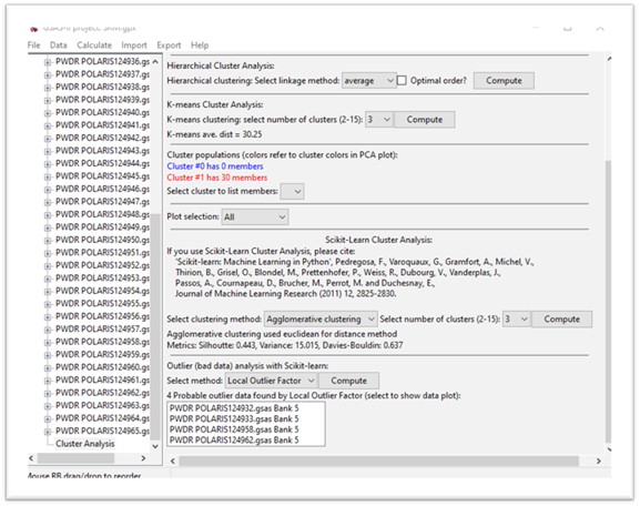

The plot shows the “good” points in red and the “bad” ones in black and the data display shows a list of the “bad” data. If you select one of them, the Powder Patterns plot tab will show the data. Try the other methods; they might work (or might not). They do work better for other data distributions.
This completes the cluster & outlier analysis tutorial; feel free to try the other distance, hierarchical and outlier methods. Do examine the plotted distance matrix; careful study of this plot can tell you much about the nature of your data, and the cluster analysis should reflect what you see there.